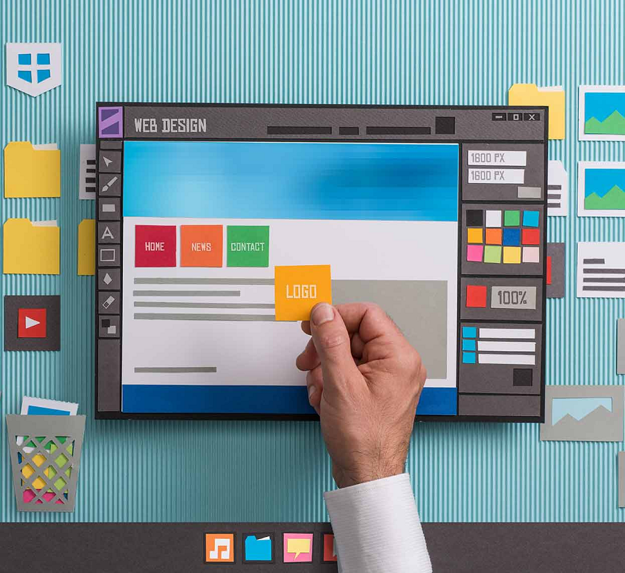
When looking at anything on the internet today, you need to thank about the massive time, work, and effort that goes into creating a unique web site or blog and making data for it almost data. With more than a billion active websites and blogs online, this is something many people tend to forget about, but it’s a process that is happening daily.
With this in mind, the last thing you want to is to start a new website from scratch and then give upright when you start seeing new problems or obstacles in your way. This is often just a side thought for users of WordPress, as it’s pretty much a free CMS that makes the process of going live with your site just a few clicks of the button.
I previously wrote an article on some tips web designers can give to their clients to minimize challenges down the road. I felt I should follow up on this with some additional tips. You can find some more below.
Tip 1: Make Sure Customers Understand the Importance of Choosing the Right Title
When coming up with a new title for your web site or recent articles, it’s important to not just write for the search engines but to write as if real people are going to be visiting your site. A perfect example of this would be if you were to write a letter to a friend or family. You wouldn’t write it with a bunch of keywords, but instead real content and focus.
You need to make sure that you clients understand the importance of choosing the right title with their webpages. Unfortunately, many clients are oddly stubborn about wanting to use their own titles. They are even pickier about them than they are most of the more visible design elements.
You need a response to convince customers to use your titles. I’ll give you an analogy to illustrate the customer’s concern and your respective response. Imagine that you have a car rental business and that this service is only offered in Boston.
The most normal is that you have a section where you show your catalog of available cars, well, although you like very much as the title: “Our cars”, I will try to convince you that it is much better to put as h1: “Cars for rent in Boston”.
We do this explanation with this same example many times.
Tip 2: Make sure customers understand that web page copy is created to drive traffic and conversions
With billions of people getting on the internet today, it’s important to make sure you know who your target audience is, what they are looking for, and how you can provide it to them. Without these measures in place, your site is just another piece of junk on the internet just adding clutter to the mix.
Longer webpages tend to rank better in Google, which drives more conversions. Unfortunately, many customers are reluctant to use them.
Here is a common response we see on almost a daily basis:
“It’s just too long.” “I just don’t like the sound of it.” “I can also rent it to a client in Toledo, and he’ll think I don’t…”
Of course, your customers have the right to put the title they want to this and the rest of sections of their website. However, they need to know not come to you later with that your website does not appear in Google!
Normally web designers ask their customers to give all the information they have, but the designers usually give this advice to those customers who already have a website and have huge text blocks in all sections on all sections on their website.
We recently had a customer in the teaching space say the following:
“Ok I understand perfectly, don’t worry, I have very clear what I have to say because it’s true that in the old web there was too much text…”
Now, when it comes to actually writing the content for your site, you need to make sure it’s written in a format and language that people are going to enjoy ready. A perfect example of this would be the article you are reading right now. It’s laid out into sections and shorter sentences, which makes the whole reading process more enjoyable.
A week after the delivery of the website, when we check how everything is going we find the festival of color and typographic multiracialism…
Tip 3: Make sure customers don’t get too carried away with aesthetics
Many people care more about the aesthetics of their website than its functionality. You need to communicate the importance of a design that works, rather than one that merely looks pretty. This is why you need sound design elements, like the ones covered in this YouTube video on Mighty Deals fonts.
You may have a customer that says something like this:
“It’s just that it was getting dull, that’s why I asked you to make it a manageable website because I like to put different colors and fonts on it.
I like it much better that way because the one you made me look very serious…”
“Let’s wait until you’re sure you’re going to write before opening your blog. It’s better not to have a blog than to have it dreary and give a bad image, go write a couple of articles and we’ll talk”
Another common response from marketers and brands are:
“No no no put it on while we’re at it, let the web be complete (eye). Besides, I’m sure I’ll write, you’ve already explained to me how important it is…”
How to Deal with Common Site Building Issues
Having a website or blog is really great, but it can also be very frustrating when trying to fix something that you just can’t figure out.
Be sure to run through each of the common scenarios above and see which might apply to your site or business. The faster you can get them solved, the better off you will be.
How to Get Started with a High Quality Site of Your Own
Now that you’ve had a moment to read through our article on how to start a website or blog and also creating great content in the process, it’s now time to get started with a blog of your own.
To learn more about this process, click here and then start sharing your own site content with everyone on social media and with the rest of the world.
